Infographics in Technical Writing
Have you seen the recent boom in infographics? Everybody and their mom is doing them. Infographics are used to illustrate complex data, timelines, trends, cheat sheets and much more. They make complex processes easier to understand and visualize trends that you can't see with the naked eye.
Can infographics be used in technical documentation? At Magnolia we drew a roadmap for migrating from Magnolia CMS 4.4 to 4.5. It is a winding road that involves many tasks. Each milestone is explained on a wiki page in detail.

Here are the design guidelines I used in case you want to create an infographic of your own.
Use a diagram tool such as Visio or OmniGraffle. You will be using lots of boxes and connectors and resizing and scaling the elements. Working with vector shapes is easier and results in a sharp image.
Max width 1000 px. Keep the width under 1000 pixels. This is a size that everyone can see without scrolling horizontally. Screen resolution does not matter. All modern displays can easily display a 1000 px wide image. What matters is the browser window size. Not everybody browses in full-screen mode. I know this because Google Analytics provides a handy Browser Size visualizer. It tells me that 90% of visitors to the Magnolia wiki see the migration roadmap without horizontal scrolling. That's a comfortable margin.

Max height = 3 x width. I made up this rule. I don't like excessive vertical scrolling either. If your infographic is intended for printing, a tall image will spill on too many pages.
Legible, large fonts. Corporate identity might dictate the font you must use. Fortunately, you have a large canvas so go big. The purpose of an infographic is not to show all the gritty details. The point is to abstract the details and show trends and conclusions. If you use an infographic to support technical documentation then put details in the supporting documentation pages. There is a temptation to cram lots of tiny items into the image. Resist, my friend.
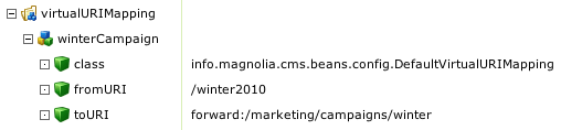
Cut clippings and use them in the supporting documentation. If you do a roadmap diagram like I did, you may want to cut it up and use the pieces to illustrate the supporting documentation. They will create visual connections that make the reader go "oh yeah this is the step I already saw in the big picture."
Inspiration and examples:
Can infographics be used in technical documentation? At Magnolia we drew a roadmap for migrating from Magnolia CMS 4.4 to 4.5. It is a winding road that involves many tasks. Each milestone is explained on a wiki page in detail.

Here are the design guidelines I used in case you want to create an infographic of your own.
Use a diagram tool such as Visio or OmniGraffle. You will be using lots of boxes and connectors and resizing and scaling the elements. Working with vector shapes is easier and results in a sharp image.
Max width 1000 px. Keep the width under 1000 pixels. This is a size that everyone can see without scrolling horizontally. Screen resolution does not matter. All modern displays can easily display a 1000 px wide image. What matters is the browser window size. Not everybody browses in full-screen mode. I know this because Google Analytics provides a handy Browser Size visualizer. It tells me that 90% of visitors to the Magnolia wiki see the migration roadmap without horizontal scrolling. That's a comfortable margin.

Max height = 3 x width. I made up this rule. I don't like excessive vertical scrolling either. If your infographic is intended for printing, a tall image will spill on too many pages.
Legible, large fonts. Corporate identity might dictate the font you must use. Fortunately, you have a large canvas so go big. The purpose of an infographic is not to show all the gritty details. The point is to abstract the details and show trends and conclusions. If you use an infographic to support technical documentation then put details in the supporting documentation pages. There is a temptation to cram lots of tiny items into the image. Resist, my friend.
Cut clippings and use them in the supporting documentation. If you do a roadmap diagram like I did, you may want to cut it up and use the pieces to illustrate the supporting documentation. They will create visual connections that make the reader go "oh yeah this is the step I already saw in the big picture."
Inspiration and examples:
- Pinterest.com: infographics
- Cool Infographics
- Did you know that Florence Nightingale was not only a nurse but also a statistician? Check out this early polar area diagram illustrating the causes of mortality during the Crimean War.
